
Chart View
Click the icon in the workspace sidebar to open Chart View.
Charts are built from the surveys you check in the sidebar and any filters you’ve applied.
Every chart has two download icons in its corner:
- download chart - saves the chart as a PNG image.
- download data (csv) - saves the chart’s underlying data as a CSV file.
Some charts also have a condense labels toggle, which replaces long category names (such as odour sources) with numbers, and adds a Key column to the table below the chart so you can match the numbers back to their names.
Measurement Data
Frequency Distribution
The Frequency tab shows how often each odour property was recorded across all positive odour events (any instantaneous measurement or timed sample (sniff) with an intensity greater than 0).
Any filters you apply on the map view automatically apply here too, since this tab uses the same filter panel as the map.
Each chart displays:
- The frequency (%) of each category
- A summary showing the total number of measurements, samples/sniffs, and positive odour events
- A table listing each category with its frequency (%) and count, plus a Total row
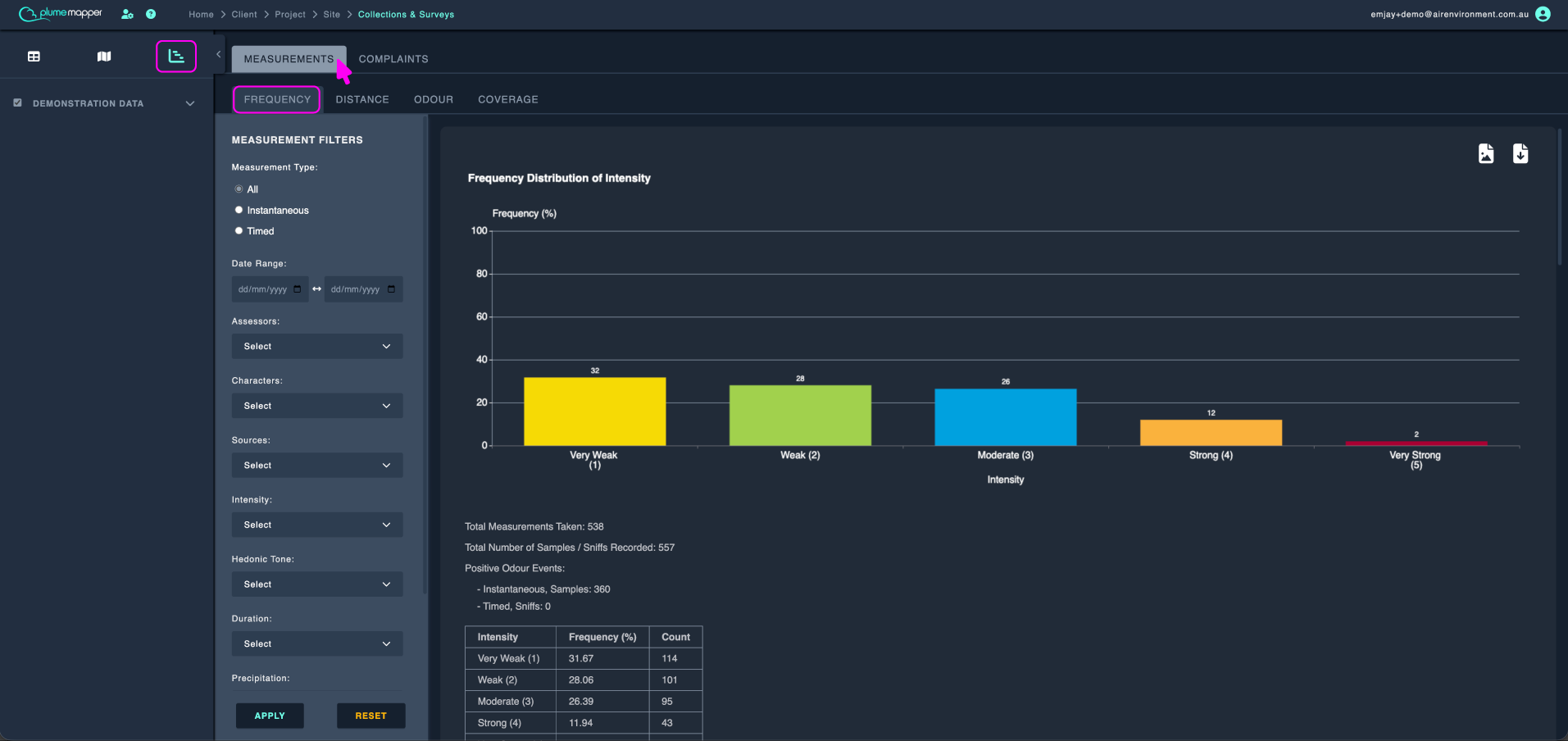
The six frequency charts are:
- Frequency Distribution of Intensity - shows how often each intensity level was recorded, using the site’s intensity scale.
- Frequency Distribution of Hedonic Tone - shows how often each tone rating was recorded, using the site’s tone scale.
- Frequency Distribution of Duration (instantaneous) - shows how often each duration value was recorded for instantaneous measurements, using the site’s duration scale.
- Frequency Distribution of Duration (timed) - shows the percentage of sniffs (with intensity above 0) within each timed measurement, grouped into duration bands.
- Frequency Distribution of Odour Sources - lists recorded sources from most to least frequent. Supports condense labels.
- Frequency Distribution of Odour Characters - lists recorded characters from most to least frequent. Supports condense labels.
Distance
The Distance tab shows how far each positive odour event was from its source.
Distance is calculated as the shortest distance from where the measurement was taken to the edge of the matching source zone. This means the tab only includes odours where the recorded source matches a source-type zone you’ve set up.
Tip: Add source zones on the map to use these charts - see zones.
The same Measurement Filters from the Frequency tab apply here.
Each chart is a box plot. Here’s how to read it:
- The box shows the middle 50% of data (from Q1 to Q3), with a line marking the median
- The whiskers extend to show the typical range (1.5 × the interquartile range)
- Individual dots outside the whiskers are outliers - unusually high or low values
- The table below lists the Minimum, Q1, Median, Average, Q3, Maximum, and Outliers for each category
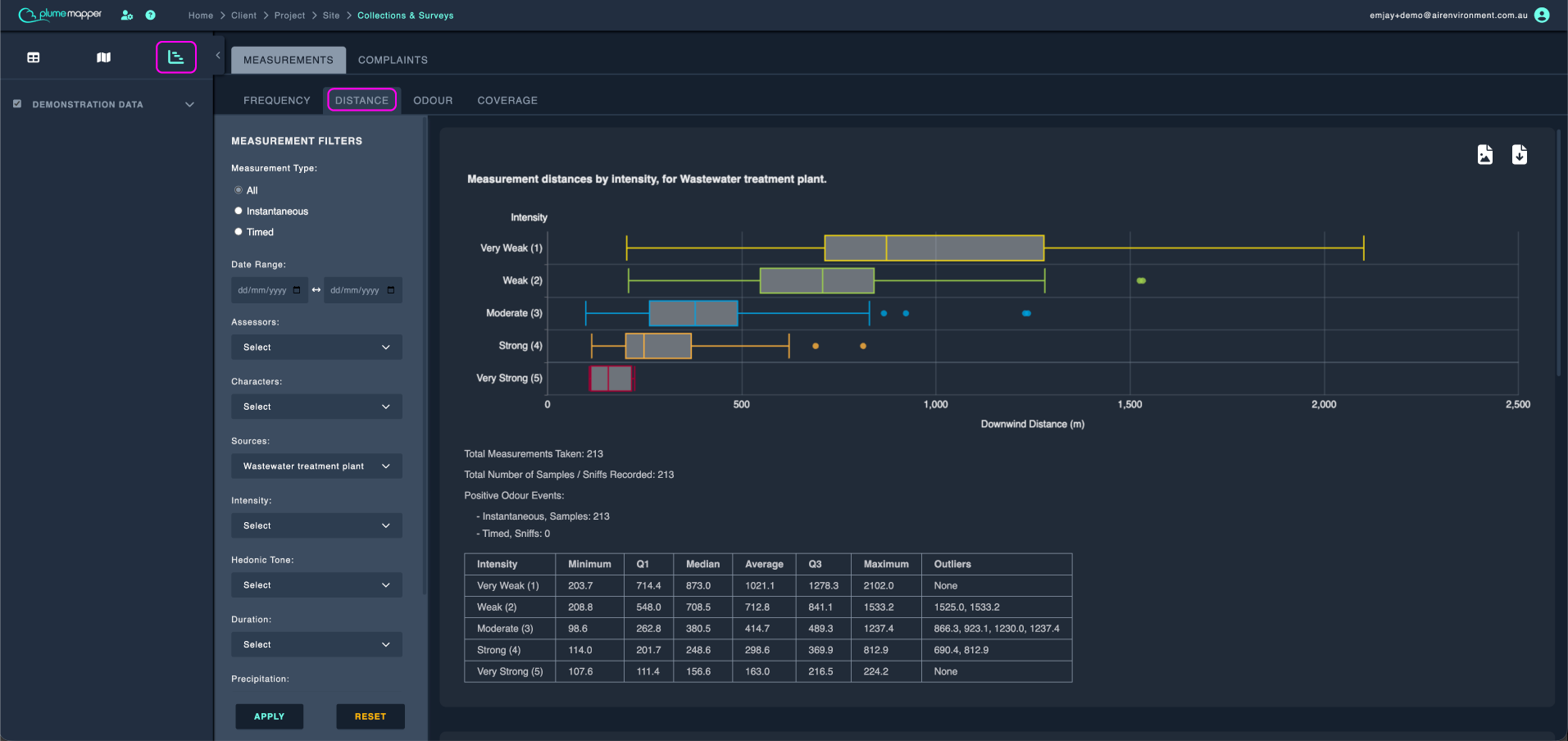
Available charts:
- Measurement distances by intensity, for <source> - appears when only one source zone has data, broken down by intensity level.
- Measurement Distances, grouped by odour source zones - appears when multiple source zones have data. Supports condense labels.
- Measurement Distances, grouped by wind speeds - breaks distances into wind speed bands: 0–0.5, 0.5–2, 2–4, 4–6, 6–8, 8–10, and >10 m/s. For timed measurements, the average of the start and end wind speeds is used.
Odour Overview
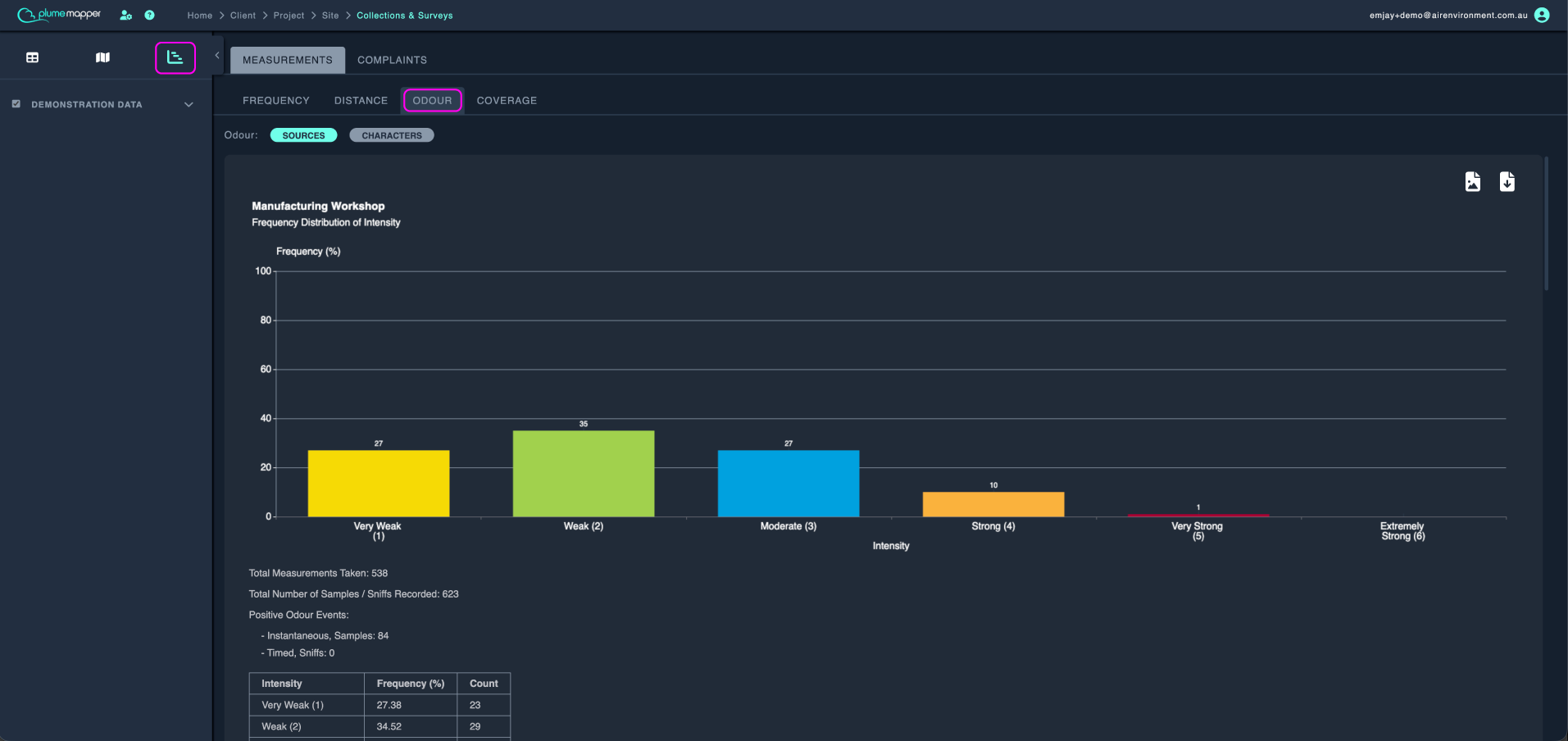
The Odour tab shows how odour intensity breaks down by sources or characters.
This tab uses all measurement data from your surveys, regardless of any filters you’ve applied.
1. Choose sources or characters at the top.
2. Scroll through the charts. Each one shows the intensity distribution for a single source or character.
Coverage
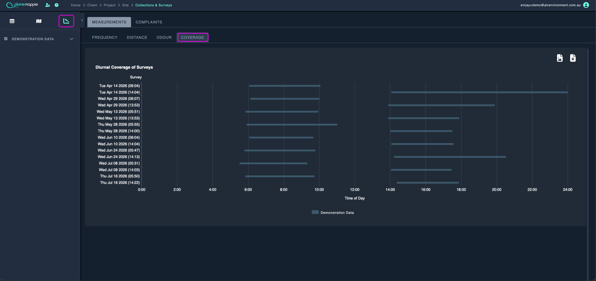
The Coverage tab displays a Diurnal Coverage of Surveys timeline - a visual overview of when your surveys took place throughout the day.
Each horizontal bar represents one checked survey, stretching from its start time to its end time across a 24-hour clock.
- Bars are coloured by collection, with a legend below the chart
- Hover over any bar to see exactly how long that survey lasted
- All times use the site’s local timezone
Complaint Data
The Frequency tab shows how often each odour property was recorded across all complaint data.
Any filters you apply on the map view automatically apply here too, since this tab uses the same filter panel as the map.
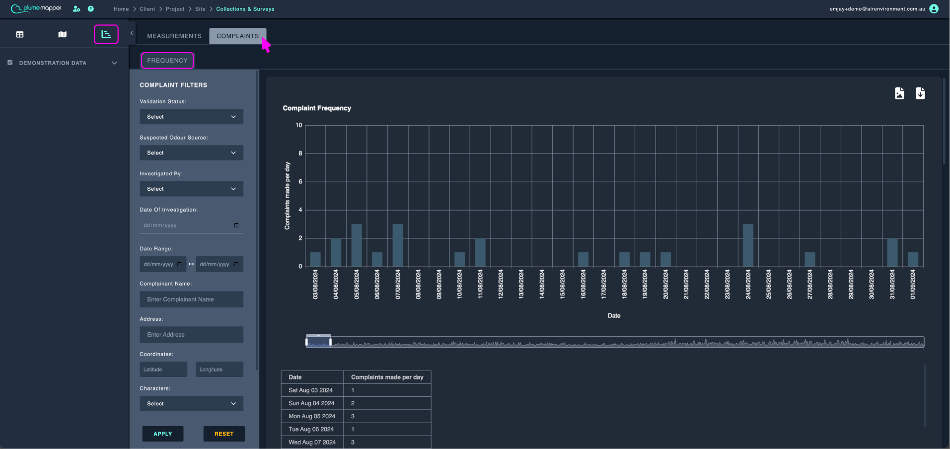
The six frequency charts are:
- Complaint Frequency - shows how often a complaint was recorded.
- Frequency Distribution of Intensity - shows how often each intensity level was recorded.
- Frequency Distribution of Hedonic Tone - shows how often each tone rating was recorded.
- Frequency Distribution of Duration (instantaneous) - shows how often each duration value was recorded for each complaint.
- Frequency Distribution of Odour Characters - lists recorded characters from most to least frequent. Supports condense labels.